The esthetics and functionality of ecommerce stores have followed in the wake of technological advancement. As a result, customers are no longer easily impressed by plain looks and basic functionalities offered in most online shops
Ecommerce merchants must invest in attention-grabbing design and unique and innovative shopping experiences to distinguish themselves from competitors and win over their target audience. Once a distinctive approach appears on the market, many merchants jump on the bandwagon, leading to the creation of ecommerce design trends.
This article presents the latest ecommerce design trends through real-life examples. Use them as inspiration to create a unique design that engages customers and communicates your brand’s message
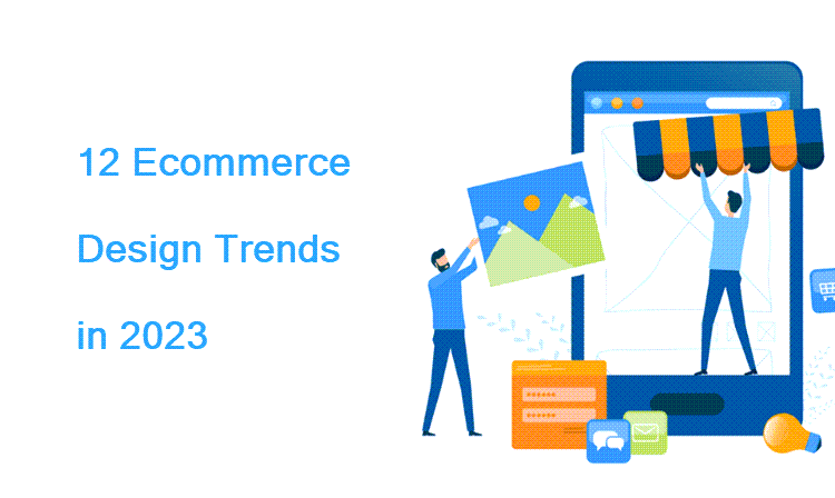
Ecommerce Design Trends – Top 12 to Look Out For
The following 12 ecommerce design trends are currently ubiquitous in the industry. Mastering them ensures that an ecommerce business stays relevant and on-trend.
1. Minimalism
In design, minimalism refers to a clean look achieved using as few elements as possible. This means the website has simple lines, textures, shapes, and a reduced color palette. The look is achieved through the use of:
- Blank/white backgrounds
- Simple product imagery against a monochromatic background
- A single font, often in all-caps
- A simple, monochromatic logo
The benefits of applying minimalism to an ecommerce store are:
- Easy navigation
- A clean and polished look that accentuates the products
- Fast page loading thanks to fewer elements on the page
The drawback to minimalism is that it is overused and offers no element of surprise to online shoppers. In addition, when poorly done, minimalist design makes a website seem bland and boring, causing customers to lose interest.
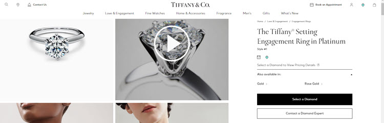
Although applicable in most industries, minimalism is a must for high-end jewelers. Tiffany dedicated two thirds of the product page layout to product images and videos. Customers are not cluttered with information but instead offered a brief description of the product with information about the crown jewel – the diamond.
2. Chatbots
A chatbot is software that automatically replies to queries made by visitors to a website. Chatbots are typically used in ecommerce to answer frequently asked questions. However, with a hint of ecommerce personalization, website chatbots can follow customers throughout their journey and help them:
- Find products of interest
- Complete purchases
- Track their shipments
- Open disputes
- Request returns or refunds
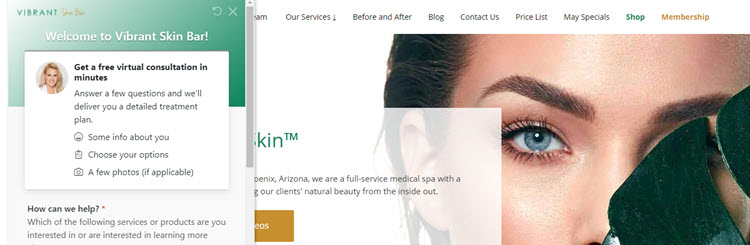
With some extra investment, chatbots can provide personalized ecommerce customer service in the form of consultations. The website of Vibrant Skin Bar, a luxury medical spa and skincare product retailer, features a chatbot that connects visitors to a professional medical consultant.
Note: Learn about the endless possibilities of using chatbots in ecommerce by reading our article Ecommerce Chatbots: How To Use Them To Boost Sales.
3. Bold and Unconventional Layouts
A bold and unconventional layout is one that is not the cookie-cutter, grid-like store with a white background launched with a shopping platform’s native free theme. Brands use bold design to communicate to their target audience and direct their attention to the selling points of the brand.
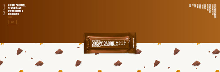
The selling point of Simply Chocolate is the use of natural ingredients. This message translates through the brand’s simple but bold 50:50 design. Half of a product’s page is the wrapper color of the chocolate, and the other half is filled with the product’s ingredients. The star of the show, the product, takes center position on the page.
Eye-catching and therefore popular, this approach works best for well-established brands. For example, the brand Air Jordan places the shoes in the center of the screen and lets products speak for themselves
The brand’s homepage is a minimalistic combination of large images and bold typography. The images are shoes which, depending on their release year, appear more or less worn. These images are accompanied by information such as the model's name, release year, designer, original price, etc.

As the brand’s target audience are collectors, the homepage features all the models released since the brand’s inception in chronological order.

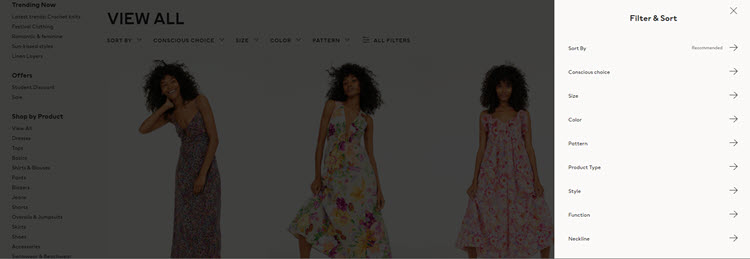
4. Better Product Filtering Controls
Product filtering options are one of the main factors that determine an online shopper’s experience. If not designed from a customer’s point of view and with their best interests in mind, product filters prevent customers from finding what they need and actually reduce sales.
Product filtering begins from the homepage. The navigation bar features main product categories and subcategories, which allow users to narrow down the products they want to view.
This is the point where special filters come in. The right choice of filters depends on a brand’s product offer and usually the more filters a store has, the better. However, it is essential that these filters:
- Make sense. A gardening tool manufacturer is unlikely to give customers the option to filter products by color because, in most cases, the color does not matter to the customer.
- Are organized logically. In the case of a retailer selling headphones, for example, store visitors should be able to filter headphones based on the way they connect to a device (wired or wireless). As Bluetooth is a kind of wireless connection, and type-c and 3.0 jacks are subcategories of wired connections, it would be redundant to have the following categories alongside each other: wired, wireless, Bluetooth, 3.0, type-c. This selection of filters could confuse customers who are not that knowledgeable about technology. The solution would be to introduce subcategories in the navigation bar or offer subcategory filters.
- Do not feature categories with 0 products. The purpose of a filter is to help potential customers find the products they need, not lead them to a dead end. This is solved by programming filters so that they do not appear when there are no products to display.
A good example of a comprehensive navigation bar and robust product filtering system is H&M’s online store. When searching for a dress, users can narrow down the products they view based on as many as 17 elements, including material, pattern, neckline, waist rise and occasion.
5. Gender-Neutral Design
With the rise of movements challenging gender norms and stereotypes came ecommerce brands that offer gender-neutral products. However, the impact of these social changes is also visible in brands that still categorize products by gender.
Gender-neutral ecommerce design is characterized by neutral colors and the use of models of different genders (or no models) in product imagery, regardless of product category. This trend is prevalent in the fashion industry, which has been blurring the lines between genders for a long time now.
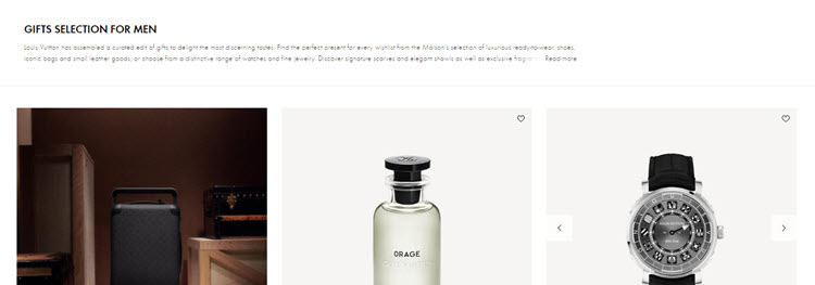
Louis Vuitton implements this concept by using a minimalistic white shop design and prioritizing product images over those of models. To see how a product fits on a model, the user must scroll through several product images. The men’s and women’s categories also feature similar color palettes.
Note: Check out CCBill's ultimate list of ecommerce web design tips.
6. Augmented Reality
Augmented reality (AR) refers to the practice of visually altering space in real time. Using their mobile devices, buyers interact with brands and their products, achieving an in-store experience in their own homes.
One of the significant insecurities people have about shopping online is that they cannot try out products. AR solves this issue by allowing people to experience products via:
- Virtual try-on solutions, typically used for fashion and cosmetics.
- Virtual placement previews, commonly used for furniture and household items
IKEA Place is one of the first AR-powered apps to achieve commercial success. The app allows users to select a piece of furniture and virtually place it in a space to see what it looks like and how much space it takes up.
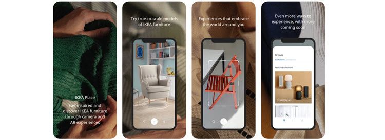
Once customers are happy with their choice of product and placement, they can take a snapshot and send it to their family and friends. This way online furniture shopping becomes as inclusive and engaging as in person.
7. Green Ecommerce
Green ecommerce (also known as eco-friendly or sustainable ecommerce) refers to a set of practices online businesses implement to reduce negative environmental impact. But how does this relate to ecommerce design?
It is an unwritten rule and standard practice that earth tones (shades of brown, green, and blue) are used for the design of green ecommerce websites, applications, branding, and marketing collateral.
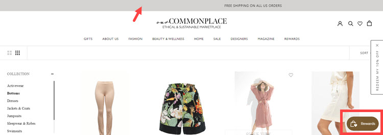
OurCommonplace is an online marketplace that features products from ethical and sustainable brands. The store features a minimalistic design and earth-tone accents.
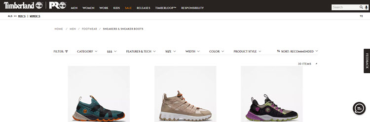
Timberland is known for sustainable shoe manufacturing practices, and the design of the brand’s online shop conveys that message as well.
8. Voice Shopping

Voice commerce refers to the practice of enabling customers to shop using voice commands, which are processed by a smart device (e.g., smartphones and smart home devices). Users’ audio input is turned into search queries, allowing them to browse, get product ratings, check availability and pricing, and place an order.
Note: Voice shopping is not a design trend, but rather a functionality that affects the overall design of an online shop. When an online shop offers voice shopping, all its contents must be formatted and organized in a way that complements the software and helps it fulfill its purpose.
The benefits of voice shopping include:
- Convenience and accessibility. Voice shopping does not require people to hold a device or be in its immediate proximity. In terms of convenience, this technology allows people to shop in their preferred manner, be it from bed or while multitasking around their home. In terms of accessibility, voice shopping allows people who typically require assistance to shop independently.
- Low implementation costs. Voice shopping is implemented via third-party integrations (i.e., middleware) which process voice inputs, transform them into queries, and retrieve data from a database.
- Personalization. Ecommerce stores can use customer interactions (including voice commands) to personalize the entire experience.
- Competitive advantage. Voice shopping is an untapped market and implementing it gives brands a competitive advantage.
9. Dark Mode

Dark mode is the ability to switch the colors of a website to a darker palette, which is more suitable for sensitive eyes and nighttime browsing.
The benefits of dark mode are not only its eye-soothing capabilities. Dark mode uses less battery power, which is important considering one third of all online purchases in 2021 happened via a smartphone, according to Statista.
The main drawback of implementing dark mode in ecommerce are the design challenges. All elements that are visible in the standard version of a website must be equally visible and functional in dark mode, all the while following branding guidelines and good design practices.
10. Micro Animations
Micro animations are short animations that enhance the visual experience of using an application or website. A common example of micro animations are toggles and buttons in smartphone or PC settings – they slide, change colors, look “pressed” while being held.
In ecommerce, micro animations make the shopping experience dynamic and smooth-looking. They are used for:
- Product image carousels
- Product variation previews
- “Added to cart” notifications
- “Added to wish list” confirmations
- Product pages
11. Mobile-First Design
Many online shoppers prefer shopping via smartphone instead of other means, such as a personal computer or similar, and it is no wonder. People carry smartphones with them all the time, and mobile applications are designed to be simple and convenient.
Many web designers try to translate that mobile experience into traditional ecommerce websites by implementing a mobile-first approach. This means that a website is designed primarily for mobile phones, and then adapted to and optimized for larger formats.
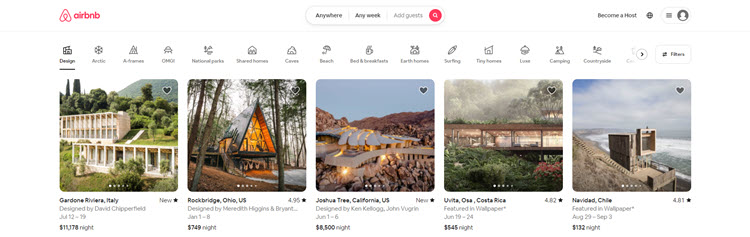
This approach is ideal for Airbnb, a rental marketplace whose users typically look for accommodation on the go using their smartphones. The brand’s website features a minimalist design with a card layout and simple icons for easier navigation.
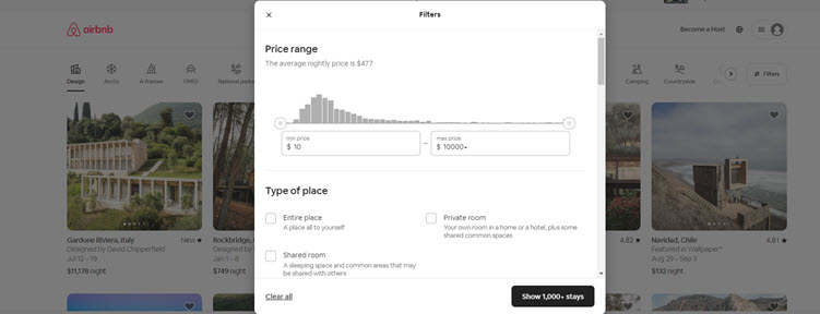
Even the filtering options for rentals feature an app-like design, with rounded corners, checkboxes, and toggles.
12. Connecting the Digital and the Physical

Ecommerce peaked during the pandemic because everything had to go digital. People who avoided online shopping were forced to try it, because at some point, that was the only way to get what they needed
Restrictions on movement have been lifted, but people have become used to the convenience of online shopping. To make the most of these changes in shopping habits, businesses have worked to connect the physical and the digital. It is now common practice for ecommerce stores to:
- Give customers the opportunity to check the availability of products in physical stores.
- Send special offers via mobile applications, the offers being redeemable only in physical locations.
- Give customers the opportunity to reserve or order products for pick-up.
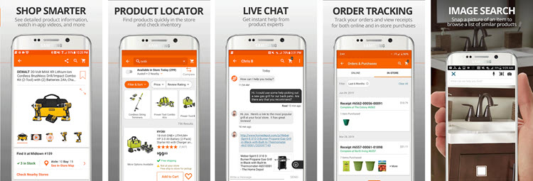
Home Depot took this connection to the next level by allowing customers to use the brand’s app to:
- Check the exact location of an item while in-store.
- Take photos of items to check whether Home Depot offers similar products.
- Scan UPC or QR codes of products to see detailed descriptions, reviews, etc.
Things to Remember When Implementing Design Trends
It is important to remember that trends are temporary, and even the best ecommerce design needs to be refreshed after a while. Jumping impulsively on trends is also counterproductive when a particular style does not match a company’s mission, vision, and branding. Another important thing to consider is consistency in branding. Changing a company’s image every season makes it unrecognizable to its audience.
Keep up with trends, but only incorporate those that match the company’s branding and ideas. The recommended time for major re-branding is 7-10 years, with minor changes in between.
Conclusion
As beneficial as it may be to jump on trends, it is important to keep the business’s needs and goals in mind. Use the examples and information provided in this guide to determine whether to implement current ecommerce design trends in your online business.