A well-designed ecommerce website is an effective tool for generating sales. It is also a great way to improve customer satisfaction, which is essential for long-term business growth.
When building an ecommerce website, there are many design factors to consider and choices to make. Combined, these design elements make the difference between an average online store and one to which customers gladly return.
To help you understand the principles of quality ecommerce web design, we have compiled a list of 10 practical ecommerce web design tips. Read on to learn more on how to make a great ecommerce website.
Ecommerce Web Design Tips
By using various design tricks, web designers can greatly improve the conversion potential of an ecommerce website. Implement these 10 web design tips, and transform your ecommerce website into a profitable business venture.
1. Enable Easy Navigation
Upon reaching the landing page, customers should find it easy to navigate to other pages of the website. Customers need to be able to reach any page no matter where they are.
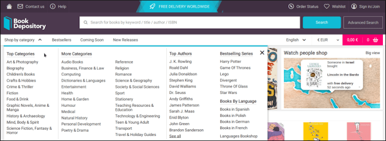
The easiest way to implement easy navigation is with a navigation bar. The navigation bar usually sits at the top of the page in the header section, or along the left side of the page, and is accessible from every page.
The navigation bar includes navigation categories and subcategories, including Products, Pricing, Shipping, Store Locator, FAQ, About Us, the Shopping Cart, and others. Additional categories are usually accessible from drop-down menus.
2. Use High-Quality Images and Videos
High-quality images are essential for enticing customers to buy products. When choosing images, keep these rules in mind:
- The product in the image should be well lit, centered, and clearly stand out against the background.
- Images should be zoomable and scale to fit a variety of screen sizes.
- 360 views of a product add another layer of detail and immersion and should be used when possible.
- Images should be compressed while maintaining quality to ensure fast loading times.
Videos are another powerful conversion tool for ecommerce websites. They are used to display products in action and explain their uses and features. A good product video is:
- Short and to the point.
- Include captions for silent viewing.
- Have a responsive aspect ratio for mobile and desktop viewing.
3. Maintain Visual Hierarchy
The foundation of a good user experience is visual hierarchy. This means that the visual elements of the ecommerce website come together to form a coherent whole.
Carefully consider where you place each design element because not everything is equally important on a webpage. Good visual hierarchy means that customers are smoothly guided toward other elements in the hierarchy. They go where you want them to go and understand what you want them to do: forms terminate with clear CTA buttons, product descriptions are next to product images, etc.

4. Make it Responsive
Mobile phones occupy almost 60% of the ecommerce market. As a result, responsive design is a top priority for ecommerce websites. Your website should scale to different screen sizes without losing functionality or visual fidelity.
Responsive design involves developing two versions of the website, one for mobile users and one for desktop. Most ecommerce website builders have responsive design enabled by default, ensuring your website works equally well on all devices.
Here are some tips on how to ensure your website is responsive:
- Cut down on the content. With screen real estate at a premium on mobile devices, carefully consider what content is essential.
- Right-size CTA buttons. Make sure it is easy to press all the buttons with a thumb.
- Adjust the images, icons, and videos. The visual collateral on the site needs to adjust automatically to the device used.
- Adapt the typography. Make sure the headings and body text are easy to read on a small screen.
5. Employ Consistent Branding
Consistent branding means that all design segments reflect the message you want to convey. Branded design helps an ecommerce shop stand out from the crowd and gives a sense of uniqueness.
Customers subconsciously absorb branding and are more likely to come back as recurring customers. They also tend to spread positive word of mouth about the brand.
Consistent branding involves:
- Creating a visual style guide and implementing it on all website pages.
- Using your logo as a basic design element and ensuring its visible on every page.
- Employing a consistent color scheme.
- Sticking to a set combination of typefaces.

6. Ensure a Seamless Checkout Process
One of the most common reasons customers abandon their shopping carts mid-checkout is a poor checkout experience. The issue arises from a combination of factors, including faulty third-party payment processing plugins, mismatches with the rest of the website's design, unresponsive buttons, and buggy payment forms.
To ensure a seamless checkout process, it is essential to design better payment flows. CCBill provides an easy-to-use interface to develop user friendly flows and payment forms with the FlexForms system.
7. Provide Multiple Contact Options
Customers often have questions about products and services that they cannot find in product descriptions and FAQs. To get answers, they look for ways to contact the business. The best way to address this issue is by providing multiple, convenient contact points. These can include:
- A live chatbot for responding to questions.
- A live chat for communicating with ecommerce customer service agents.
- A contact form for sending emails.
- A contact phone number.
8. Implement Search and Filters
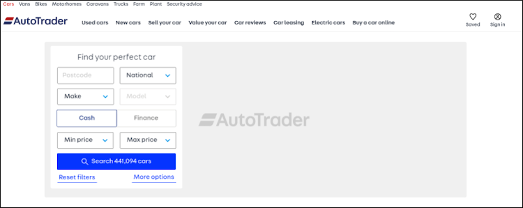
The sooner the customer finds a product they are interested in, the more likely they are to make a purchase. The best way to facilitate easy shopping is by providing features for searching and filtering.
The search feature should support partial queries, result previews from the product page, and search operators to narrow down the search. Filters should include a wide range of parameters, including price, manufacturer, availability, and others, depending on the product type.
Additionally, both search and filtering solutions should have a sorting feature to make it more convenient for customers to find what they are looking for. Items are sorted by:
- Price.
- Number of units sold.
- Customer ratings.
- Date added.
- Alphabetically.
9. Display Related Products
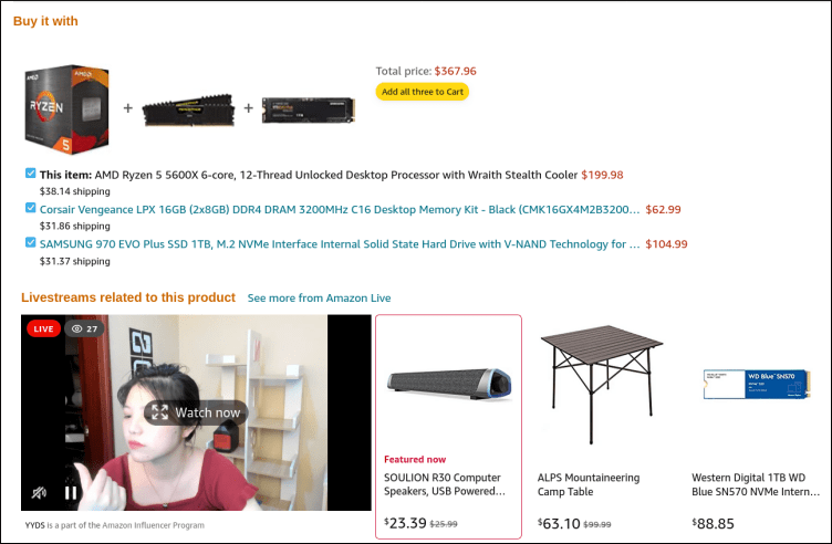
Displaying related products boosts sales and increases customer satisfaction.
There are two main techniques for displaying related products:
- Upselling. A technique used to encourage customers to buy a more expensive version of a product they are currently viewing. For example, a customer buying a smartphone may be tempted to get an upgraded version with a larger screen and more memory. Read our article and learn how to upsell.
- Cross-selling. A technique used to encourage customers to buy related products. For example, a customer buying a bicycle may buy protective gear as well.
All related products should be easy to spot and with clearly labeled prices, descriptions and benefits. Most importantly, all related products must be relevant to the customer.
Note: Follow the link to learn about the differences between cross-selling and upselling.
10. Display Customer Testimonials
Testimonials are a clear signal for customers to trust a brand. Therefore, displaying customer testimonials prominently on an ecommerce website is social proof that boosts sales.
The homepage is usually a good place for general endorsements from notable individuals, whereas product pages are more suited for ratings, comments, and reviews. Customer testimonials in the form of videos are also impactful and are an opportunity to showcase your product or service in a real-life situation. For instance, ask customers to make a short video, in which they exclaim why they bought your product.
Note: Never use fake reviews and testimonials. Customers will see through it and distrust the brand.

11. Plan Ahead for Omnichannel Retail
Ecommerce startups find it difficult to implement an omnichannel strategy right from the start. However, that doesn't mean you shouldn't plan ahead and develop the shop and the brand with omnichannel retail in mind.
Take into consideration that if things go according to plan, you will need to diversify sales and communication channels. A sound omnichannel strategy provides several interconnected sales channels in which customers are free to start their buyer's journey in one sales channel and then seamlessly jump to another to complete the purchase.
12. Follow Tried and Tested Strategies
Good ecommerce web design is not just a matter of creativity. It is about using techniques already proven to generate favorable business outcomes. You do not need to reinvent the wheel with your ecommerce design, and the last thing you want to do is confuse your customers.
A good approach is to see what works in your niche and upgrade where necessary. For instance, you might be considering adding a questionnaire to help customers find a product they like. If your customers are used to comparison tables to find what they want, there is no reason to innovate just for innovation's sake. The result can backfire, causing your customers to go to the competition.
Conclusion
Designing an ecommerce website from scratch seems like a massive hurdle to overcome. The key to approaching the task is careful forethought and planning.
Be clear on your goals and the message you want to convey. This will inform your design decisions. Use these 10 tips and your common sense to create a memorable experience for your customers and ensure the success of your ecommerce store.
