Good user experience (UX) is essential for subscription-based businesses.
Some UX practices can help businesses and membership sites ensure a smoother flow through the process of signing up for subscriptions This helps generate enough predictable monthly recurring revenue for successful budgeting.
In this article, we’ll discuss the subscription flow and present 10 subscription UX best practices
10 Subscription UX Best Practices
Make the Subscription CTAs Prominent
A properly placed and highlighted call to action (CTA) is a valuable part of subscription flow.
Arranging several CTAs around a business website increases the chance of turning chance visitors into loyal consumers. Consider using multiple CTAs and placing them where they complement existing content – the navigation bar, the sidebars, the end of the page or post, etc.
However, don’t to overuse CTAs. If there are too many, they affect the website’s UX and interrupt the subscription flow.
The Babbel app for language learners uses CTAs well. There’s one CTA, highlighted in orange. They show the key benefits and statistical data to convince visitors to “get started.”
Don't Be Pushy
Pop-ups have their place. Attractive and purposeful pop-ups can generate more subscribers and boost revenue.
A report published by Sleeknote shows that pop-ups with images convert far better than those without such visuals. The same source claims that pop-ups with a countdown timer are more efficient.
Don’t bomb visitors with too many pop-ups. Make them meaningful and witty.
Don't Block Your Content Too Early
Most websites have some access restrictions. Some hide all the content, while others allow partial access, depending on subscribers’ paid plans. These features help entrepreneurs highlight the exclusive nature of their content.
However, be careful with these restrictions. Setting a paywall gate early could frustrate new users who want to see what you offer.
Note: Browse through our list of best paywall platforms on the market and find the most suitable one for your needs.
A well-placed content block adds to the subscription flow and retains visitors on the website.
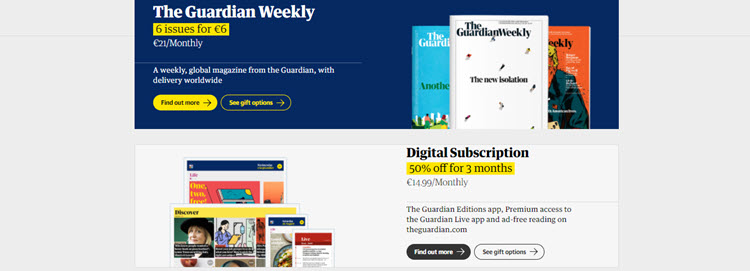
The Guardian provides smooth UX while using an unaggressive paywall. Readers can access all content without any restrictions. However, free users are exposed to ads on this website, while subscribers are not.
Subscribers also get additional features, like a 14-day free trial.
Design Emotions into the Subscription Flow
Emotions are a vital part of every subscription UX practice. Business owners can create a sense of urgency, guilt, happiness, excitement, or any other emotion with their CTAs.
When weaving emotions into the subscription flow, establish clear intent. Think about the feelings you want to evoke, the actions you want to provoke, and how they will convert users into customers.
Test different emotion-based elements to see which ones work best for your audience.
Basecamp uses the before and after technique to stir users’ emotions. If they subscribe to these services, they’ll lead an organized, progressive business life and feel calm and relaxed. To top it all off (literally), there are excerpts from customer reviews.
Don't Trick Users into Subscribing
Businesspeople starting a subscription business might not be aware of how important it is to be completely sincere with users. Misleading users doesn’t pay off in the long run. It damages the business image.
Don’t use tricks or ambiguous CTAs to attract users. Keep the subscription flow straightforward and be honest when setting the pricing plans and their features.
Design Clear Subscription Plans
Setting clear and accurate subscription plans is also part of an honest subscription strategy.
Make the Pricing section visible on the homepage. When the users click on this tab, they should immediately see the pricing plans and their features. Consider using various subscription pricing models.
Communicate with potential and existing customers to learn what they think about the pricing tiers.
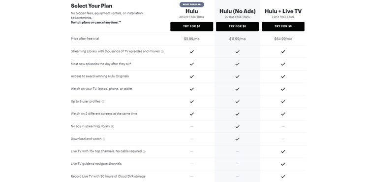
Hulu gives a detailed presentation of their pricing plans. They show their three different tiers and list the features for each. Users know in advance what they pay for and what they get.
Design an Effortless Payment Process
Subscribers are more likely to quit the service if paying for their subscription doesn’t go smoothly. This increases the churn rate and affects revenue.
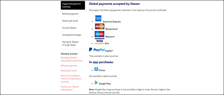
Deezer is an excellent example of a subscription business that offers plenty of payment options, from credit cards to PayPal to in-app purchases.
Design a Thank-You Page
A seamless subscription flow combines well-organized features and timely emotional appeals.
When users reach the end of their subscription flow and have become subscribers, you’ve earned their trust. Now is the time to finish this process with a personalized emotional message.
A thank-you page is a clever way to welcome a new subscriber and show your gratitude. It can appear after a customer:
- Completes the registration process.
- Makes their first purchase.
- Downloads materials from a subscription website.
- Leaves a comment or review.
Make Cancellation an Option
Users feel frustrated if they can’t stop a subscription process. When they can’t find an exit button, they usually leave the website altogether.
Subscription websites that try to force users to complete the registration process are more likely to lose prospects than convert them into subscribers.
Leave an opt-out feature available throughout the subscription process.
Design a Cancellation/Unsubscribe Page
Every subscription website needs to have a cancellation/unsubscribe page. When a customer wants to cancel the subscription, they need to be able to reach that page easily.
One option is to let users access the cancellation page directly from their profile or account.
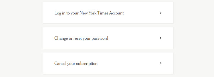
The New York Times has done this in a simple and easily accessible way. There’s a "Cancel your subscription" option available on the user’s account.
Also, add the Unsubscribe button to every email newsletter sent to customers.
Send a thank-you email to a customer that unsubscribes from your website, followed by a CTA to come back soon. Prepare a special deal for these customers and try to win them back.
These strategies will produce positive emotions in these customers and perhaps they’ll resubscribe soon.
Note: Include an exit survey in the thank-you email to find out why customers left your business. Learning why users cancel helps you understand what features of the subscription flow to improve.
Conclusion
Subscription businesses need to consider the importance of user experience when building their websites.
A user-friendly subscription website that applies the practices shared above is more likely to attract new customers and ensure higher revenue in the long run.

